Email sign ups, specifically email marketing, has cemented itself as a super-effective method of marketing. It converts leads into customers, pre-existing customers into repeat-customers and is an easy, inexpensive way to generate revenue.
In fact, a recent study showed that 59% of B2B marketers said that, of all their marketing methods, email campaigns generated the most revenue.
With the Anti-Spam Act and various other laws which protect consumers from unsolicited emails, companies must receive informed, voluntary consent from consumers in order to be able to send them emails.
Essentially, consumers have to know what they’re getting themselves into and cannot (legally) be tricked into joining your mailing list.
Consequently, the email sign-up form was born!
Since people constantly check their emails on their phone, laptop, PC or other electronic device, email marketing has never been more effective as a method of revenue generation.
So, getting people to sign-up for mailing lists has never been more vital to the success of a business.
The last thing you want to do is send subscribers packing due to a fudged, uninspired and unengaging sign-up form.
With this in mind, here are a few ideas to aid your design process, which will help to produce an engaging and effective sign-up form to boost your email sign-ups and grow your mailing list:
Email Sign Ups – Keep it simple
This is a hard-and-fast rule of an effective sign-up form. Firstly, since the attention span of the modern day consumer is pretty poor, the design should be simple enough that potential subscribers can read the key parts of the sign-up form in a few seconds.
Secondly, and most importantly, the functional ‘enter your info here’ part of the sign-up form should be simple and (very) quick to complete.
Don’t ask subscribers for more than their first name and email otherwise they’ll think it’ll take too long to complete and it isn’t worth joining your mailing list.
This example, by Everlane, demonstrates simplicity at its best.
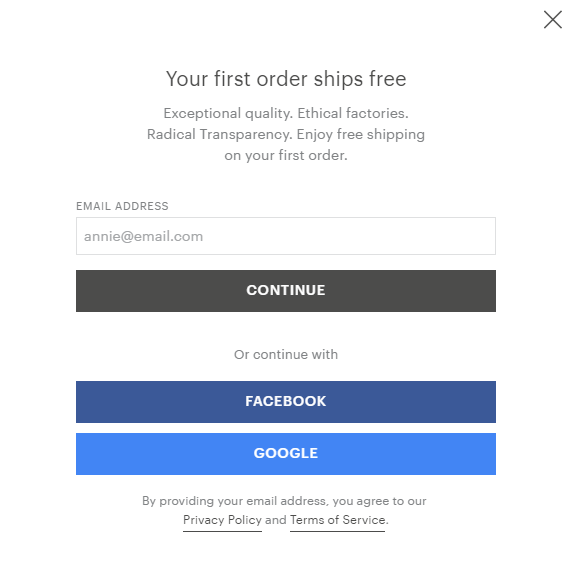
Image source – https://www.everlane.com/
Email Sign Ups – Use herd mentality to your advantage
Include the number of email subscribers you already have on the sign-up form in order to show that lots of other people thought it was worth it to subscribe to your emails.
This method makes a company or brand seem desirable to new potential subscribers since consumers trust other consumers more than any other marketing method.
Melyssa Griffin lets web visitors know that there are already 200,000 thousand people on her list.
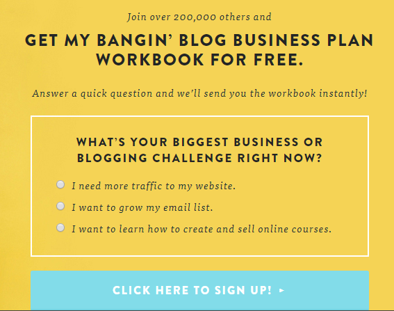
Image source – https://www.melyssagriffin.com/
Email Sign Ups – Make it attractive
This probably seems like an obvious suggestion, but plenty of companies and brands fall short on this simple aspect of designing a sign-up form.
If the sign-up form is ‘too much’- that is, if it’s too bright, garish or overcrowded with text, then potential subscribers will be in a hurry to get it off their screens.
Losing subscribers because of a bad aesthetic is a waste and easily avoidable. Study your buyer persona to empathize with your target audience. Think about what they would and wouldn’t want to have popping up at them when they access your site.
Casper incorporates the 4th of July theme by using fireworks and creating an eye-catching sign-up form in the process.
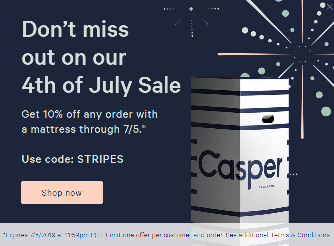
Image source – https://casper.com
Email Sign Ups – Tailor the sign-up form to the individual
Some companies choose to add check boxes or drop-down boxes to their sign-up form, so that potential subscribers can choose what kind of emails they receive.
While this is a potential source of clutter on your sign-up form, I’d argue that it’s worth it.
If potential subscribers know that their inboxes won’t be clogged up with emails that are irrelevant to them, they are more likely to subscribe.
More than this, when they see your company’s name attached to emails in their inbox, they’re more likely to engage with the email since they know they’ll probably be interested in the content.
Therefore, they’re less likely to become ‘desensitized’ to your emails (mentally seeing them as spam and opting to mark them as read automatically) if they frequently engage with the emails you’re sending.
The New York Times offers a reader favorite as the main option but also provides three additional choices to potential subscribers.
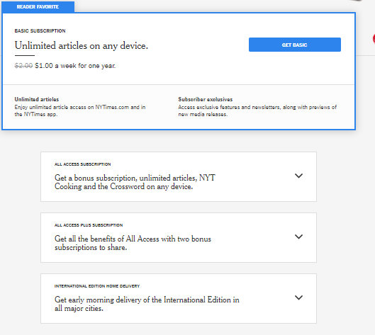
Image source – https://www.nytimes.com/subscription?campaignId=797YR
Email Sign Ups – Keep it casual
Include a friendly, familiar message that humanizes your company and gives potential subscribers the impression that you’re their friend.
A greeting, compliment or anything else your friend might say is often enough to grab someone’s immediate attention.
Emailmonday’s “Hi there!” is a call to attention and gently nudges readers to at least read the content of the sign-up form.
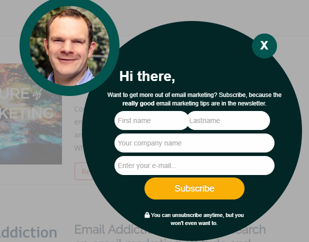
Images source – https://www.emailmonday.com/
Email Sign Ups – Give incentives to subscribe
Lots of companies choose to provide discounts or bonuses to people on their email sign-up list in order to provide an incentive to sign-up in the first place.
To secure as many email subscribers as you can, make use of any promotions you plan to give to the people on your mailing list by displaying them on your sign-up form.
This can be either a permanent promotion you plan to always give your email subscribers or temporary promotions.
My Clickfunnels Bonus incentives to subscribe include not only a free trial of ClickFunnels but also every single one of my sales funnel bonuses.
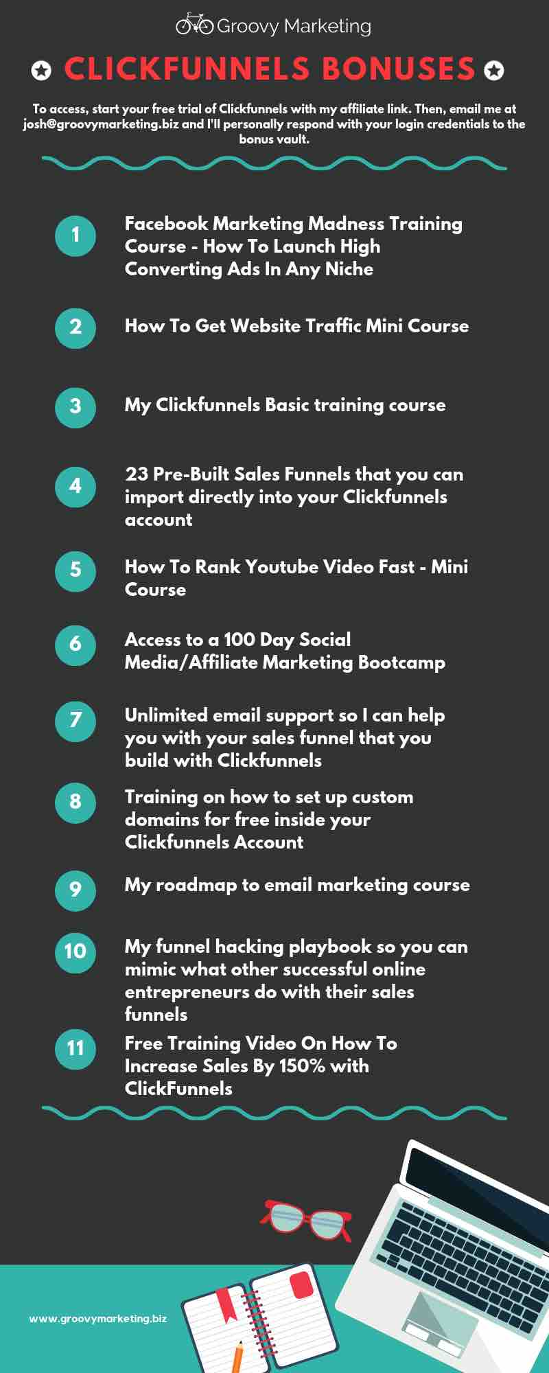
Image source – https://www.groovymarketing.biz/
Email Sign Ups – Make potential subscribers think about the consequences of not signing-up
Instead of a simple, standard exit button, you could make an exit-button out of text.
For example, you could hyperlink a line of text such as “No thanks, I don’t want to receive information about promotions and deals” or, if you offer an exclusive subscriber-only promotion deal, you could have a more persuasive “No thanks, I don’t want to save 20% on my next order.”
Social Triggers does this in a slightly different way by getting the site visitor to actively reject a free gift.
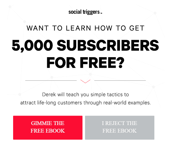
Image source – https://socialtriggers.com
Email Sign Ups – Make it more of a process to navigate away from the sign-up form
Often, when people are faced with pop-up sign-up forms, their reflex action is to get rid of the pop-up box and get back to what they were doing without really thinking about whether they want to sign-up to your mailing list.
One of the biggest problems with this is that these pop-up boxes usually only pop up to site visitors once so, even if potential subscribers realize they do want to subscribe (after instinctively clicking away or thinking they’ll do it later), they are often not presented with the opportunity to subscribe again.
As an alternative, you could install a sign-up form on your site and have it displayed on the navigation bar.
Fast Company has an unobtrusive sign-up form in its brand colors to tell it apart from ads.
Image source – https://www.fastcompany.com/technology
Email Sign Ups – Stay on brand
Just because sign-up forms should brief, that doesn’t mean that they should lack personality.
It’s not only the color scheme that matters when branding your sign-up form. The language used should also be consistent with the rest of your site and marketing in general.
Shinesty provides “outrageous clothing for theme parties, costume parties, and general ridiculousness”. Their sign-up has a fairly plain design but it uses distinctive copy to grab attention.
Image source – https://www.shinesty.com/
Email Sign Ups – Include an image of your bonuses
People appreciate visuals. More than that, content with visuals get 94% more views than those without.
If you’ve got a highly relevant lead magnet, take a screenshot and add it to your sign-up form.
This will not only draw attention to your form but will give the reader a better idea of what they’ll get when they sign-up.
For example, Practical Commerce has included an image of their bonus ebook to on their sign-up form.
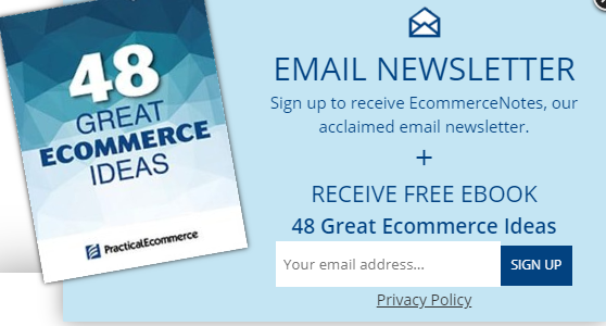
Image source – https://www.practicalecommerce.com/
Email Sign Ups – Make your emails seem like a commodity
There are a number of ways you can do this. You can offer free ‘goodies’ to those who subscribe and simply using buzzwords like ‘exclusive’ and ‘free’ makes potential subscribers feel like the current subscribers are part of a special, select group, that get access to things that non-subscribers don’t.
Plus, the word ‘free’ makes whatever your emails contain seem like something worth paying for and therefore makes it exciting.
For example, if you were to say, ‘exclusive access to free styling advice and tips on how to get the best deals,’ it makes it seem like you’re cheating yourself if you don’t sign-up.
The retailer, Bruno Magli, highlights its exclusive rewards for those who opt-in.
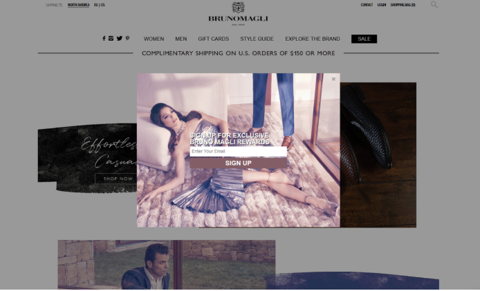
Image source – https://www.brunomagli.com/
Email Sign Ups – Use fear of missing out (FOMO)
Everyone wants to get ahead of the game in some way. A sign-up form idea is to get your readers to realize that they can get an inside scoop when they opt-in to your email.
One way to instill FOMO is to have a limited time offer on a discount or special promotion.
Or take a leaf from Gong’s book. They invite readers to join other sales leaders. This call to action encourages anyone who considers themselves to be a sales leader to become part of winning group of people benefiting from an unfair advantage.

Image source – https://www.gong.io/
While it would be difficult to implement all of these ideas into your sign-up form design process (while keeping the form simple and easy to complete), you can apply some of these tips in order to maximize your email subscriber base and increase sales and revenue.
You need powerful email marketing software to design the perfect opt-in form.
Aweber provides hundreds of sign-up form templates to give you inspiration to action these ideas.
Creating a sign-up form with Aweber is quick and easy. Here’s a quick rundown:
Create a Sign-Up Form.
Select a template from the template gallery.
Select the color scheme you want
Add text to your header.
Name your sign-up form.
Enter the URL where you want to send users after they complete the form.
‘Save Your Form.
Sign-up to Aweber using my affiliate link at no extra cost to you, but I may get a small commission if you sign-up using this link.
The awe-inspiring sign-up form ideas show that, no matter what business you own, you can use some creativity to super-charge your email list and your sales.